Overview
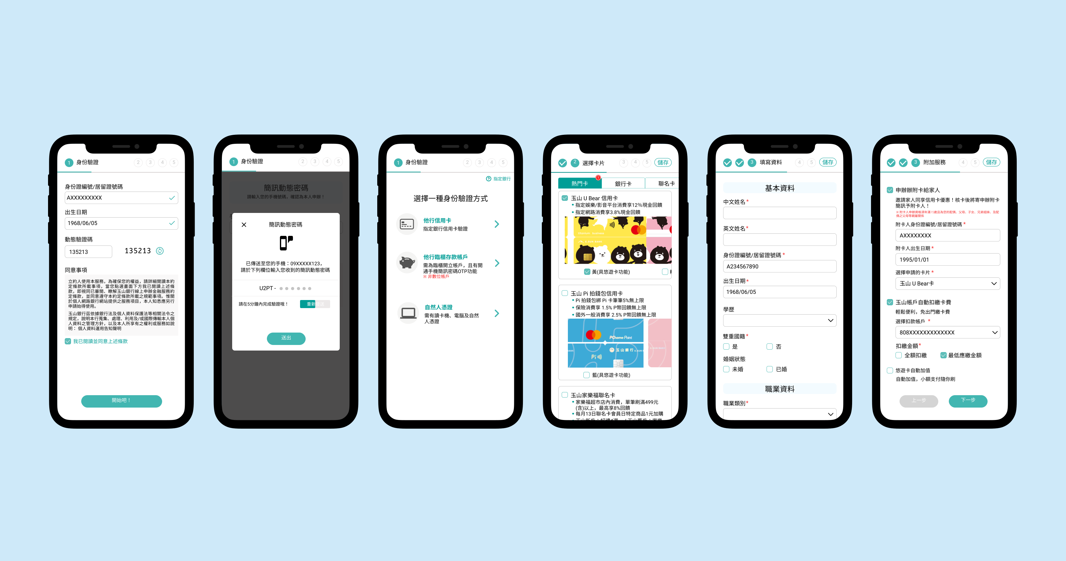
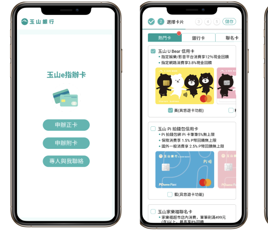
In banking industry, the important asset was our customers. With the trend of the digital transformation, banks started to redesign user experience in each touch points when customers use digital products. As a product manager in credit card digital platform team, my colleague and I proposed to redesign user experience in the flow of applying for credit card.
My Role - UX Researcher, UI/UX Designer
- Customer Research & Insights
I created a customer satisfaction survey for a specific customer group and collected data and feedback to uncover insights and customers’ pain points.
- In-house interview
Frontline employees who directly interacted with customers knew what are touch points when customers applied for a credit card. Therefore, I interviewed 2 employees to share their views. This helped to gain more detailed insights with various scenarios they provided.
- Project Planning & Scope Definition
I defined the product with my product manager partners. We set customer goals and balanceed business goals. Moreover, I established the project timeline and milestones to put a project team together.
- UI/UX Design
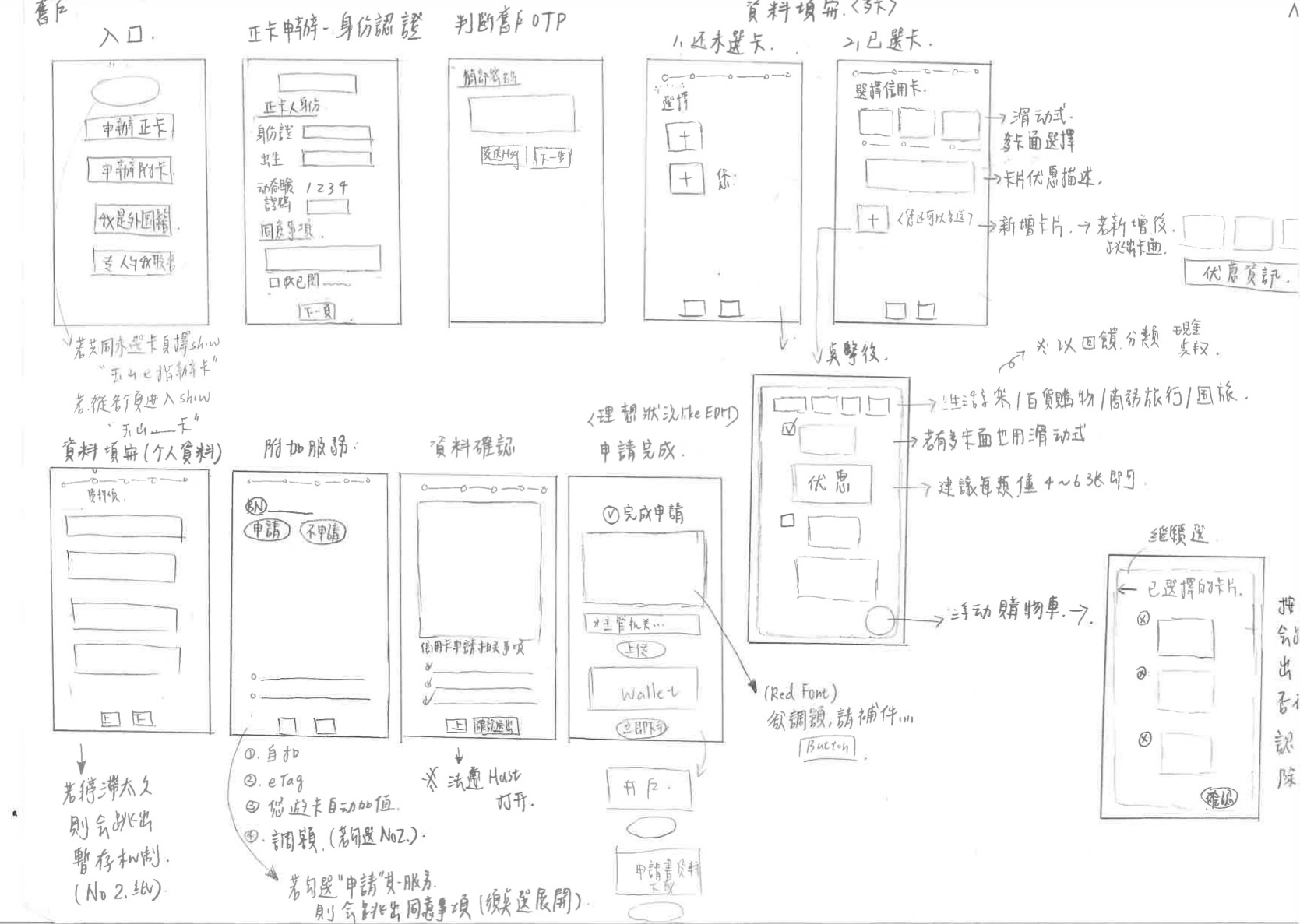
I created user flow, wireframes and prototypes by Figma and also discussed the user flow with compliance officers to make sure that it would not violate regulations and laws.
Project Milestone
.svg)
Researched customers’ pain points and needs through in-house interviews and survey. Conducted competitor analysis to identify the advantages and disadvantages of our product.

Ideated design solutions, set the project scope
and goals, and initially redesigned user flow.

Discussed user flow with compliance officers, created wireframes and prototypes, and iterated design.

Planed to conduct a project assessment with IT managers to make sure that it can be executed.
Research Findings
Competitor Analysis
We analyzed 7 competitor banks' applying process and organized their advantageous features.
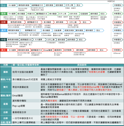
• The feature of temporarily store information could lead customers easily continue to finish.
• Most competitors’ UI design was not user-friendly, but Cathy Bank and DBS Bank had good one that stimulated customers’ pleasure.
• Some banks provided a service of applying for credit cards at the same time. It could reduce time for refilling in the same blanks.

Customer Research
In the customer satisfaction survey, we selected the respondents who have applied for credit cards within the last month. Then, I conducted in-house interviews to know more about the observation from frontline employees and also from fresh graduate employees.
“ The credit card online application page only has the option for a primary card. There is no option for a secondary card, so I don't know how to apply a secondary card to my son. Even I found that the website for online applying for a secondary card, the process is vey difficult to use. I hope it can be simplified. ”
“ I am lost when filling in the personal information. I hope there would present clear steps on the application and I could know which stage I am ”
“ Because I stay too long, the website pops up the message whether I want to leave or not, but I was too nervous to mistakenly press the button of leaving the page, so all the information I had written disappeared, and it was very annoying to refill in all blanks again. ”
Key Insights
Throughout our research, we created a customer journey map and empathy map that helped us to ideate the digital solution and features to solve customers' pain points.
• Save Application Form Temporarily
• Apply for Multiple Credit Cards
• Improve User Interface Design
• Add a Feature to Apply for a Secondary Card
• Open Foreigners to Online Apply for a Credit Card
• Change Credit Card Limit at the Same Time for Existing Customers
User Flow
Based on customers' identities, there were different user flows in applying for a credit card. We logically organized user flows and planned corresponding contents and features for customers.
.svg)
Wireframe
Portotype